
It’s undeniable. The sizes of our screens are shrinking, and mobile devices are quickly taking over the global market. The widespread use of smartphones and tablets has created valuable new channels for marketing. But it’s clearer than ever that a one size fits all approach to mobile logo design will no longer cut it in the digital advertising space.
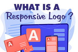
Responsive logos solve this challenge.
These logos essentially shift in size, shape, color, and even complexity to adapt to the screens they’re displayed on. It was originally thought that responsive websites and design elements would be a fleeting design fad. Nowadays, however, they are more of a necessity for brands.
Nowadays, there are more places to display your brand’s logo than ever before, and all of these channels and platforms vary hugely in terms of size. A few decades ago, businesses were encouraged to refrain from changing their logos at all costs. Nowadays, failing to change them could actually harm a brand instead.
Read on to learn more about designing responsive logos and how they can benefit your clients’ brands in the long run.

The Origin of Responsive Logo Designs
‘Responsive’ is a hot buzzword at the moment, and it’s been around for a while now. The term was originally used to describe how websites responded when displayed on different screen sizes. Previously, responsiveness ensured that websites always looked their best, regardless of whether they were being viewed on computer screens, tablets or smartphones.
Most recently, size-shifting logos have also borrowed the term. The popularization of smart mobile devices and their variations in screen size have prompted brands to think about their mantras of never changing their logos.
The Importance of Responsive Logos
Understanding the importance of responsive logos is the key when learning how to design a mobile friendly logo. Many of the benefits of responsive designs are obvious. There are so many places for modern businesses to display their logos that it’s virtually impossible to use the same version across these platforms.
More web users than ever are logging onto the internet using their mobile phones. In 2021, stats show that mobile accounts for around 50% of web traffic globally. This rising popularity of mobile browsing necessitates the need for at least one additional version of a brand’s logo to fit smaller mobile screens.
Many users have switched over to even smaller screens, like those of smart bracelets, smart watches, and smart glasses. These small screens require custom-fitted logos to ensure that the logos always look their best. Even small ads on desktop sites will shrink and distort logos, and mobile screens compound these effects. Different, customized logos for each of these platforms are therefore a necessity.
Businesses of all kinds, from online podcasts to marketing agencies, are investigating exciting and unique methods of advertising outside of the digital world. A brand that wants to add their logo to hats, pens, bags, t-shirts must consider the size of their logo and how it will look printed on these different items.
Modern video media technology allows for the use of animated logos. Thousands of companies have turned towards using video content to market their brands, and the use of video has even extended to the creation of logos now.

5 Steps to Designing a Responsive Logo
Do you want to try your hand at creating mobile logo design templates and animated logos for your clients?
Here are 5 simple steps to get you started.
1. Create Four or More Different Versions
Break down a responsive logo and you will discover a few different versions of that same logo, each varying in detail and size. If you already know where the logos will be displayed, you can model your versions according to these platforms and mediums. If you are still unsure, try using the logo variations of big name brands as inspiration.
Start with your master logo. This should contain all the information you wish to communicate, including a logo image and a company name. You can then work from there, adding and removing details and scaling visuals as you go.
2. Scale Up and Down to Create Variations
You might wonder what the differences are between the four versions of your logo we recommended you create. If you’re already experienced with responsive web design, you will know that web designers add visual details as screen sizes scale up, and remove or minimize details as they scale down.
We recommend starting this process by prioritizing the elements of your logo. Low-priority additions like slogans or established dates are great additions when you have loads of space to work with, but may take up too much room on smaller mobile screens. Including top-priority elements like the brand’s name is important, but even these may get left out in the case of extremely small screen sizes.
You might need to adjust the visual complexity of your mobile logo design. This involves reducing the level of detail, for example by iterating an image in smaller versions and replacing clear outlines with simpler, more solid lines instead. You can consider removing borders, frills, decorations, and other unnecessary elements as well.
You can simplify your color palette to scale your logo down. Complex color combinations can be difficult to see at small sizes. If there are too many hues in your design, it may become distracting and confusing on smaller screens. Sometimes, it’s best to remove all colors save for the one hue that is most easily identifiable for a brand. For example, Coca-Cola is immediately recognizable thanks to its universal red and white palette.
You’re welcome to get creative when scaling down your logo designs. Instead of removing a brand’s name entirely, for example, you could replace it with initials or an abbreviation instead.
3. Consistency is Key
Your responsive logo designs can vary widely in terms of sizes, structures and elements. But they should still be consistent when it comes to fonts, color schemes and texture effects.
You don’t need to turn every version of your mobile logo design into a new logo in its own right. Each version should instead be a subtly different version of the same, original logo for best results.
It’s important to retain common threads throughout all of your responsive logo designs to keep them cohesive. Remain consistent with color schemes and fonts, even if you have to simplify them or scale them down. These elements reflect a brand as a whole, not just the logo that represents it.
4. Don’t Be Afraid to Use Abstract Elements
When designing the smaller version of your mobile logo design, you might lose too much of the original logo when scaling down. This challenge can certainly be overcome, even though certain designs lose their appeal when oversimplified. In these cases, don’t be afraid to use abstract symbols to represent the original logo.
One of the most famous can-food companies, Heinz, does a good job of scaling its logo down into an abstract symbol. The brand has four versions of its logo, the first three are scaled down in the traditional sense by removing details. The last version, however, is simply the widely-recognized shape of their can label with a familiar color scheme to run the message home. Heinz is a well-established household name, and the company knows that its customers will have no trouble recognizing its logo, even without the brand name attached.
If you’re designing a responsive, mobile logo for a brand whose original logo is simply their name, you can consider replacing the full brand name with a monogram or initial for smaller screen sizes. Any customer familiar with the brand will still recognize the signature elements of its logo, regardless. Again, consistency is the key here. The more visual cues you can include in your design, the more easily customers will recognize the brand in question.
5. Strategically Stack and Rearrange
We’ve focused comprehensively on size when it comes to responsive logo design, but this isn’t the only aspect of the design process that matters. Responsive logos should respond to unique circumstances, which can be size, but can be a general branding environment too.
With the right graphic design software you can change up logos simply by stacking and rearranging key elements like text. Instead of eliminating certain elements altogether, you can save space and scale down your design by reorganizing the structure of all of those elements to achieve a similar effect.

The Takeaway: Responsive Design is the Future of Logo Creation
If you want to complete a task well, you need the right tools for the job at hand. Having a single, uniform logo may be convenient, simple and cost-effective, but it won’t help a brand properly cover all the most popular marketing channels in the technological age.
The more digital and real-world marketing channels that open up, the less adequate a single, unresponsive logo will be to address all of those platforms. Responsive logos are a flexible solution that ensures that brands’ logos and promotional images display at their prime across all screens, platforms and channels.
Responsive mobile logo design has the power to improve brand recognition, generate new leads and sales, and increase brands’ web traffic at the same time. This is why responsive designs are well worth the investment for companies who are aiming for significant future growth.
Design a Logo Yourself With Logogenie

If you don’t have spare cash in your budget for a logo, don’t despair. While in the past you may have had limited options, nowadays technology has advanced so that virtually anyone can design their own logo using an online logo design tool like logogenie.
In our digital era, design software is less about the technical skill of your hands and more about your creative ideas. You don’t need to master your brush strokes or pencil shading — you don’t even need steady hands. With digital logo makers, all you need is an idea.
Logogenie, and other online design tools, use templates to make design fast and easy, even for first timers. First, you select your industry from the dropdown menu.
We’ve categorized our templates by the needs and demands of the top industries, so finding yours is the first step. Our algorithm will then generate the top choices for your industry.
Simply choose the one you like and start editing. You can customize each template however you want, personalizing your choices for:
Main images
Company name and slogan
Font and typography
Color schemes
Text and picture sizes
Text and picture placement
Adding new icons
Layering (putting some images behind or in front of others)
You can choose from our internal library of over 200 icons. A quick glance shows that there are plenty of the intellectual imagery we mentioned above, including trees with rainbow leaves, shield crests, books, graduation caps, and more.
If you want to use more advanced techniques, we wrote a quick beginner’s guide to using Logogenie. This explains all the nuances of the Logogenie interface, including how to edit individual aspects of the base image, change certain colors but not other, and perfecting your typography.
Using a DIY logo maker like logogenie, you can create a professional-tier logo in just minutes. When you’re done, you can buy all permissions and commercial licensing for $24.90, which grants you your logo forever.
While the template-style of design works well for first-timers, you’ll get better results if you bone up on some graphic design basics beforehand. Keep reading our blog for special design tips, straight from expert designers.