At some point or another, everyone needs a transportation service. Whether they’re shipping commercial goods to another country or delivering grandma’s birthday gift to the next town over, transport companies provide a much needed service that we all need. That’s one of the reasons why transport logos are so important — everyone who sees them is a potential customer.
So what makes a good transport logo? And how can you design one yourself? In this guide, we explain everything you need to know about designing your own transport logo. Let’s start with an in-depth look at the 10 best transport logos so you know your destination.
1. FedEx Logo Design
The FedEx logo is a bit of a legend among logo designers. For one thing, all the basics are handled well: the typography is clear and bold, the letters are spaced smartly to conserve space, blue and gold are one of the best color combinations for logos, etc. Those make it a good logo, but what makes it a great logo is a little more subtle, almost a secret: the arrow between the second E and the X.
This arrow works on many different levels. For starters, the joy the viewer feels when discovering it stays with them every time they see the logo. It’s a gift that keeps giving. There’s also the subliminal nuance — the arrow represents movement for transportation. All and all, an Easter egg in your logo can enhance enjoyability, memorability, and communication.
2. UPS Logo Design
The FedEx rival UPS also has an inspiring logo, but for different reasons. First there’s the color scheme. As we explained in our branding guide on the meanings of colors, brown represents dependability (like a sturdy tree or the ground beneath our feet), while yellow represents friendliness and cheerfulness. As a company you entrust with your personal items these perceptions are valuable in the transportation industry.
Then there’s the shield shape, which symbolizes protection and fortitude — another key quality in a transport brand. Add to that the candid lettering and the dynamic curves at the top for flair, you have a great sample of the best transport logos.
3. MSC Logo Design

Not as famous as FedEx or UPS, the Mediterranean Shipping Company (MSC) deals mostly with freight shipping by water. How can we be sure? The “waves” in the logo are a dead giveaway, and even people who see it for the first time can guess about what industry they’re in. Such imagery can be a good signal and reminder to people if you’re not well known.
Like UPS, MSC uses a lettermark logo to display their brand initials. They too use yellow for friendliness, but pair it with a more confident black. The color black can be a bit forceful, so they opted for lower-case letters as a way to seem more light-hearted.
4. Hapag-Lloyd Logo Design
Hapag-Lloyd’s transport logo demonstrates a common design technique that can be used by any industry: combining the initials of your name in a creative and memorable way. In this case, the L is a little hidden, but that adds to the fun, like the FedEx arrow.
The color blue represents trust, and at darker shades like this also competence and adeptness. This plays into the trust involved with the transport industry and handing over your possessions.
5. DHL Logo Design
DHL shows off a technique common in the best travel logos, and for the same reason: the repeated parallel lines trick the eye in a way that suggests movement. This is a design tactic used often in comics and cartoons to make static images appear livelier — perfect for a transport company that’s always on the go!
DHL furthers this theme by adding a horizontal line through their lettermark logo, in a way that’s interesting and leaves an impression. This kind of unique flair are great cues and work well to separate your logo from all the others.
It’s also worth noting the colors: yellow again for friendliness, but also red, for urgency. Red’s a common choice for the transport industry to show clients their packages are important.
6. Venture Logistics Logo Design
While DHL uses parallel lines in a conventional way, Venture Logistics takes them to a whole new level. Vertical and slanted lines still give it a sense of movement, but as we explain in our guide on using shapes to designs logos, the direction changes the meaning. Horizontal lines suggest stability and being grounded, whereas vertical lines suggest success and prosperity.
What’s interesting about the Venture Logistics logo is the design — it’s not just one line or even three parallel lines — there’s empty spaces cut into them to give the appearance of wheels and depth. The color red, again, adds a sense of urgency to reassure clients that their packages are in good hands.
7. Hutt Logo Design
The Hutt Trucking Company has a simple logo, but effective nonetheless. it’s more abstract, with no discernable symbolism, but the shapes used speak volumes. The straight, blocky, and angular design all denote strength and security — no curves or even slants to soften it.
We also see two recurring colors, red and black. These are the two most powerful colors we have to work with, and combining them gives the impression of power and dominance. It’s not a color scheme that will fit every brand — it’s counterintuitive if you’re going for friendly and casual — but it helps to provide clients some security in the transportation industry.
8. XPO Logistics Logo Design
XPO Logistics is a pretty straightforward logo, but a good example of how you don’t need flashy visuals to make a good transport logo. The first thing you notice is the colors: red and black, for the same effect as Hutt.
But when you look closer, you notice a lot going on with the typography. The space between the letters is almost non-existent, compacting the logo so that it’s not too big. The font style also takes a minimalist approach: sans serif and no dots in the I. The T is also stylized with a sharp point to increase memorability, a technique we first described in our 10 Best Tech Logos.
9. Lineage Logo Design
Lineage deviates from the traditions of other transport logos, but that helps it stand out. For example, this is the only logo on our list to use green, not to mention it’s the only one to use a serif font. These quirks help Lineage to separate itself from the herd, a crucial duty of any logo.
However, Lineage still follows some conventions, like the shield-shaped logo. Just like UPS, the shield suggests that they’ll protect your goods during the transportation. But the real high note of this logo is the way the triangle pattern merges with different color shades — this artistic touch stays with you.
10. Maersk Logo Design
Finally, we have Maersk, whose logo is perfectly simple. In general, stars make great logos for any industry — the constant change of directions makes it fun and whimsical, while the sharp points and straight lines give it a certain authority and energy.
Maersk uses a light shade of blue to show trust and welcoming, but the blocky, straight letting in a bold black compensates by adding a little seriousness. You’ll also notice the combined A and E, the same treatment XPO Logistics gave their T to make their logo more memorable.
3 Expert Tips for Designing Your Transport Logo
Now that you’ve seen the effective techniques in actions, let’s dive deep into what you can take away from the 10 best transport logos. Keep the three tips below in mind when you design your own transportation logo.
1. Use Colors to Assuage Fears
The transportation industry can be scary from the customer side — you’re essentially handing over your property and money to a stranger and hoping for the best. That’s precisely why so much of transport logo design is about showing strength and assuaging fears.
One of the surest ways your logo can instill confidence is using the right colors. If you’re going to trustworthiness, blue works best — lighter hues come across as casual and inviting, while darker shades insinuate aptitude. If you want to show urgency and alertness, red is your best choice. Power and authority, black. Friendliness, yellow.
2. Dependable Shapes: Shields and Squares
Colors aren’t your only tool for communicating strength in your logo. Certain shapes — particularly squares, rectangles, and shields — automatically denote stability and security. The shield especially shows your commitment to protection, in this case, protecting your clients’ goods.
The trouble with rectangular shapes is that they can come across as too formal or rigid. To mitigate this, you can add some curves or rounded corners to temper the more aggressive elements. Just look at the top of the UPSlogo or the sides of the Lineage logo, and you’ll see slight curvature to make the brands seem just a little more approachable.
3. State Your Name
With all due respect, transport isn’t exactly a fun industry. That’s why transport logos have to go the extra mile to get remembered; clients don’t always feel that personal connection like they do with fashion logos or sports logos.
For this reason, it helps to state your name in your logo, often using a wordmark logo (the logo image is a stylized version of your company name, like FedEx or XPO Logistics) or a monogram logo (the logo image is the initials of your company name, like UPS, MSC, or DHL.
Just be creative about the typography you use — that’s a worthwhile opportunity to show off your brand personality. Try to give one or two letters a unique twist, and use a style appropriate to the kind of brand you want to be.
How to Design a Transport Logo
Now that you have an idea of what goes into an effective transport logo, the question is, how do you make one? Essentially you have two options: hire someone to design it for you or design it yourself. Both have their own merits and drawbacks, so let’s examine both individually.
Hiring a Designer
Professional designers know by heart all the tips, tricks, and techniques we’ve mentioned above, and then some. When you hire a designer, freelance or from an agency, you’re buying their expertise just as much as their time.
The problem is, no skilled designer works for free. The most glaring downside of hiring a designer is the cost — talented designers charge hundreds or even thousands of dollars for logo design.
Sometimes you can find cheaper alternatives on sites like Fiverr, but those sites have a poor record for delivering what they promised, and there’s tons of ex-Fiverr users who felt they were ripped off. The industry standard for a logo design is around $200, so if someone charges $5, you’re right to be suspicious.
Moreover, even if you have the money to spare, it can be difficult to find the right designer for you. Graphic design is a creative field, so there are innumerable artistic styles to choose from. You have to be sure to find a designer who both understands your vision and is capable of bringing it to life, but that can take time.
Design a Logo Yourself
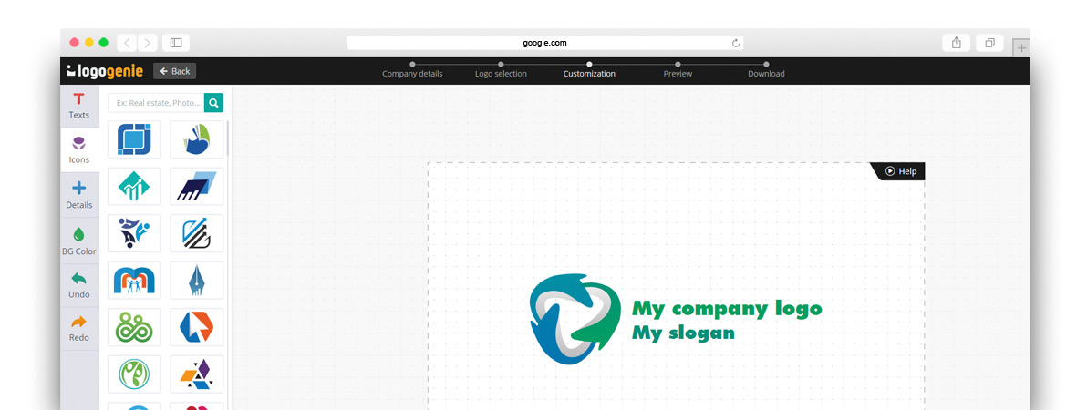
If you don’t have spare cash in your budget for a logo, don’t despair. While in the past you may have had limited options, nowadays technology has advanced so that virtually anyone can design their own logo using an online logo design tool like logogenie.
In our digital era, design software is less about the technical skill of your hands and more about your creative ideas. You don’t need to master your brush strokes or pencil shading — you don’t even need steady hands. With digital logo makers, all you need is an idea.
Logogenie, and other online design tools, use templates to make design fast and easy, even for first timers. First, you select your industry from the dropdown menu.
We’ve categorized our templates by the needs and demands of the top industries, so finding yours is the first step. Our algorithm will then generate the top choices for your industry.
Simply choose the one you like and start editing. You can customize each template however you want, personalizing your choices for:
- Main images
- Company name and slogan
- Font and typography
- Color schemes
- Text and picture sizes
- Text and picture placement
- Adding new icons
- Layering (putting some images behind or in front of others)
You can choose from our internal library of over 200 icons. A quick glance shows that there are plenty of the intellectual imagery we mentioned above, including trees with rainbow leaves, shield crests, books, graduation caps, and more.
If you want to use more advanced techniques, we wrote a quick beginner’s guide to using Logogenie. This explains all the nuances of the Logogenie interface, including how to edit individual aspects of the base image, change certain colors but not other, and perfecting your typography.
Using a DIY logo maker like logogenie, you can create a professional-tier logo in just minutes. When you’re done, you can buy all permissions and commercial licensing for $24.90, which grants you your logo forever.
While the template-style of design works well for first-timers, you’ll get better results if you bone up on some graphic design basics beforehand. Keep reading our blog for special design tips, straight from expert designers.

